Magazine Covers
I have chosen to do Human Figure because I wanted to re-create famous magazine covers.
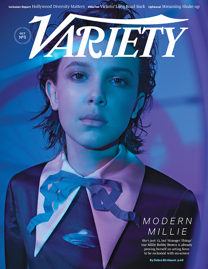
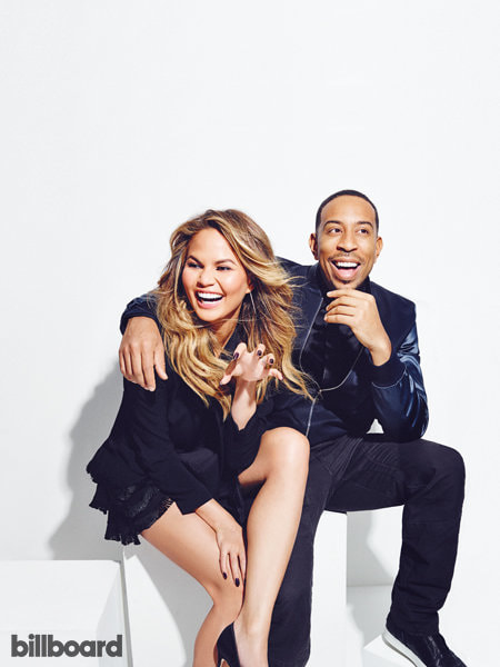
More photographs from Variety magazine |
Variety Magazine
|

|

|

|
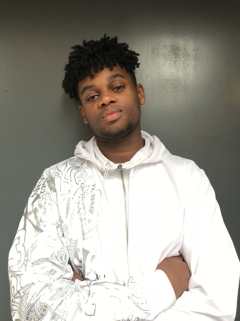
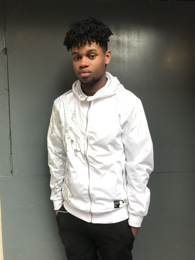
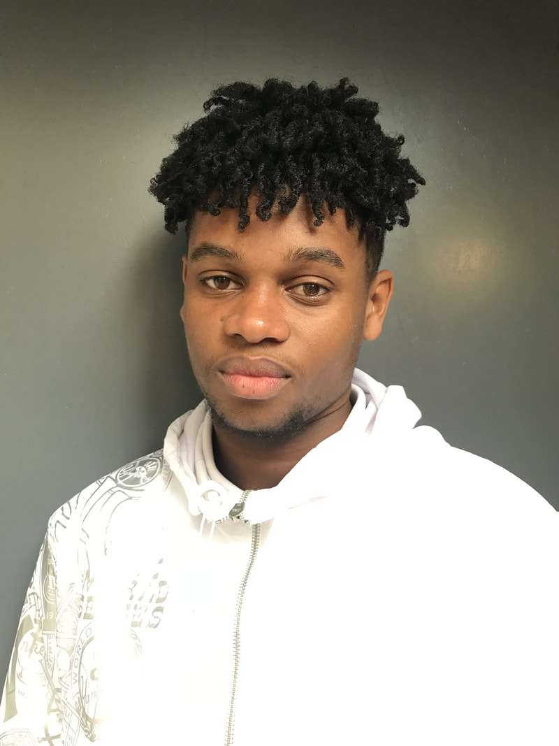
My Original Photographs


|


|


|
My edited photographs
Original

|
Edited

|

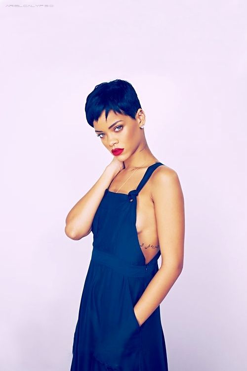
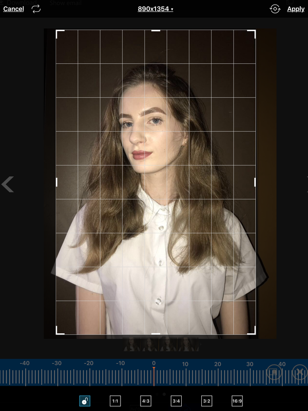
1. Firstly, I cropped down the image and used an app called PicsArt. I then went through loads of filters until I found the right one. I ended up picking one called 'Vintage' in mode 4 so it was a lot more pink, however I could've made it more purple but I liked how it looked so I decided not to change it
|

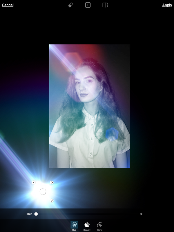
2. I then added a lens flare onto my models face as in my artist study the girl/model in the magazine cover had one over her face too. This is my favorite thing in the magazine cover, even though it's a really simple thing I think it makes a huge difference to the outcome of the magazine cover.
|

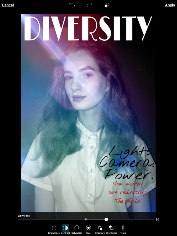
3. I added the title 'diversity' onto my magazine cover and placed it just over her head like the one in my artist study I could've placed it higher and rubbed out the parts that was over her head but in the artist study it wasn't like that so I did the same.
4. Finally I added all the cover lines onto my photograph so now it looks like a magazine cover, there wasn't a lot of cover lines on my magazine cover because in the artist study there wasn't a lot also I felt like if I added more it would look to crowded and I wanted all the attention on the girl. |
Original
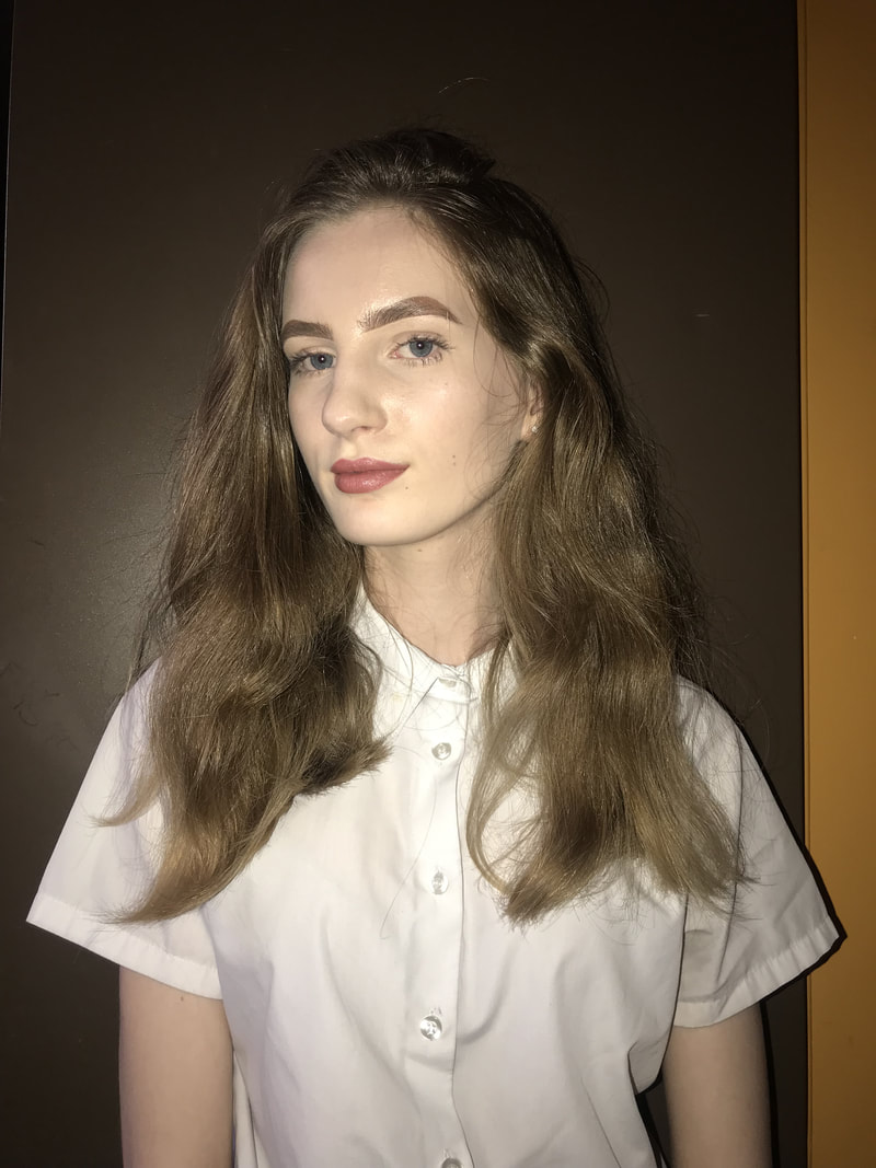
|
Edited

|

1. Firstly I went onto Photoshop and cropped the photograph, I then went onto colour balance and made it very pink because on the magazine cover with Millie Bobby Brown, it is very vibrant and pink.
|

2.I then went onto PicsArt and started to add pink lens flares onto the top left of my photograph as the picture of Millie had lens flared all on the one side.
|

3. I added multiple lens flares onto the left side of the picture to make it look similar, after that I added the title in black so it was different from my first one and the cover lines to make it look more like a magazine cover. I really like how it turned out and I really think it makes the magazine cover look a lot better. At first I thought it would look too overpowering but it didn't and I like the outcome.
|
Original

|
Edited

|

1.Firstly,I went onto PicsArt and cropped the photograph then I changed the colour gradient so it was light green and yellow, I faded it into the photograph until I was happy with it. looking back at the Photograph I feel like I could've made it look more blue rather than green but I still like the outcome of it.
|

2. Then I added the title 'Diversity' onto the photograph to make it more like a magazine cover, then I added cover lines and changed the colours of some of the words/letters. For example the number 6 is white and black and the words 'get the' are black, I did this to make them stand out a lot more and so it all wouldn't get lost in the photograph. I like the outcome of this magazine cover as it looks different from the others I did.
|
|
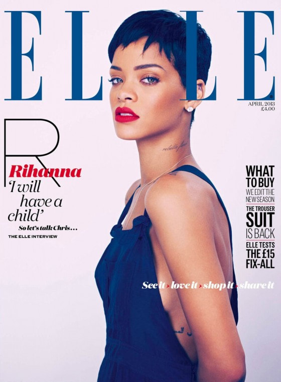
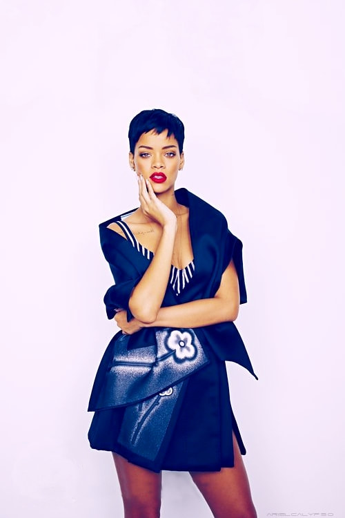
ELLE magazine
|
More photographs from ELLE magazine
|

|
|
My Original Photographs


|


|


|
My edited photographs
Original

|
Edited

|
Editing Process

1. I went on the PicsArt app and cropped the picture, I then clicked on 'face fix' and make her skin tone for even as in real magazines they airbrush the skin so it looks more flawless.
|

2. I then put a filter on called 'Orton' which made the background really light and also the model.
I then added the title 'rose' and separated it so her head was in the middle and the title wasn't over head. I really like how the title came out, I made it look a lot like the magazine cover that inspired me because I liked how it looked. 3. After that I then added lots of text in different fonts and sizes to make it look like the magazine cover that inspired me. This is one of my favorite magazine covers I made as it's very different and not like a 'usual' magazine cover. |
Original

|
Edited

|

|
TIME magazine
|
More photographs from TIME magazine
|
|
|
My Original Photographs


|

|

|
My edited photographs
Original
|
Edited

|
Editing Process

1. Firstly, I put a filter onto my photograph called 'HDR 1' and I played around with the different settings like how sharp it is and how much its faded. I did this because it made his skin look more flawless and I liked how it turned out as it doesn't make him look too different, its more of a subtle change which makes it look better.
|

2. I then added the title which place 'PLACE' and I rubbed out the parts of the letters which were over his head, I really like how it turned out. I then added the cover lines onto the magazine cover but with 'TIME' magazine they don't have a lot of cover lines as they mainly focus our attention to the person who is featured on the magazine. My magazine cover is very similar to the onw which inspired me, I chose to make it like that because I really liked the design of it and how it was set out. I like how my magazine came out, I really like how simplistic it is. I had some doubts about doing my magazine cover like this because I felt like it would look too plain and boring but it didn't so I'm happy with the outcome.
|
Original

|
Edited

|

|
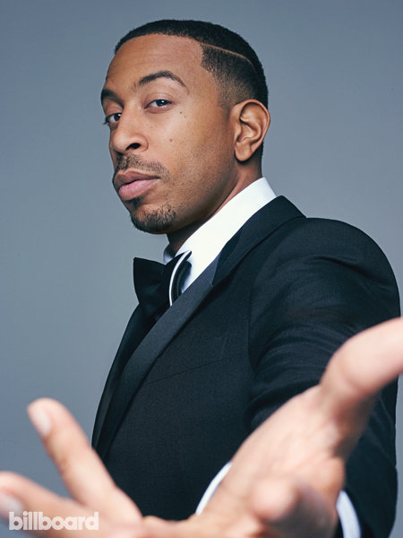
Billboard magazine
|
More photographs from the Billboard magazine

|
|
|
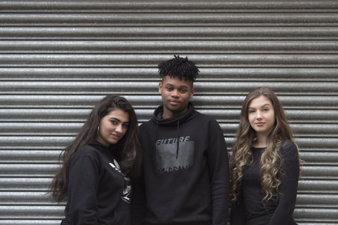
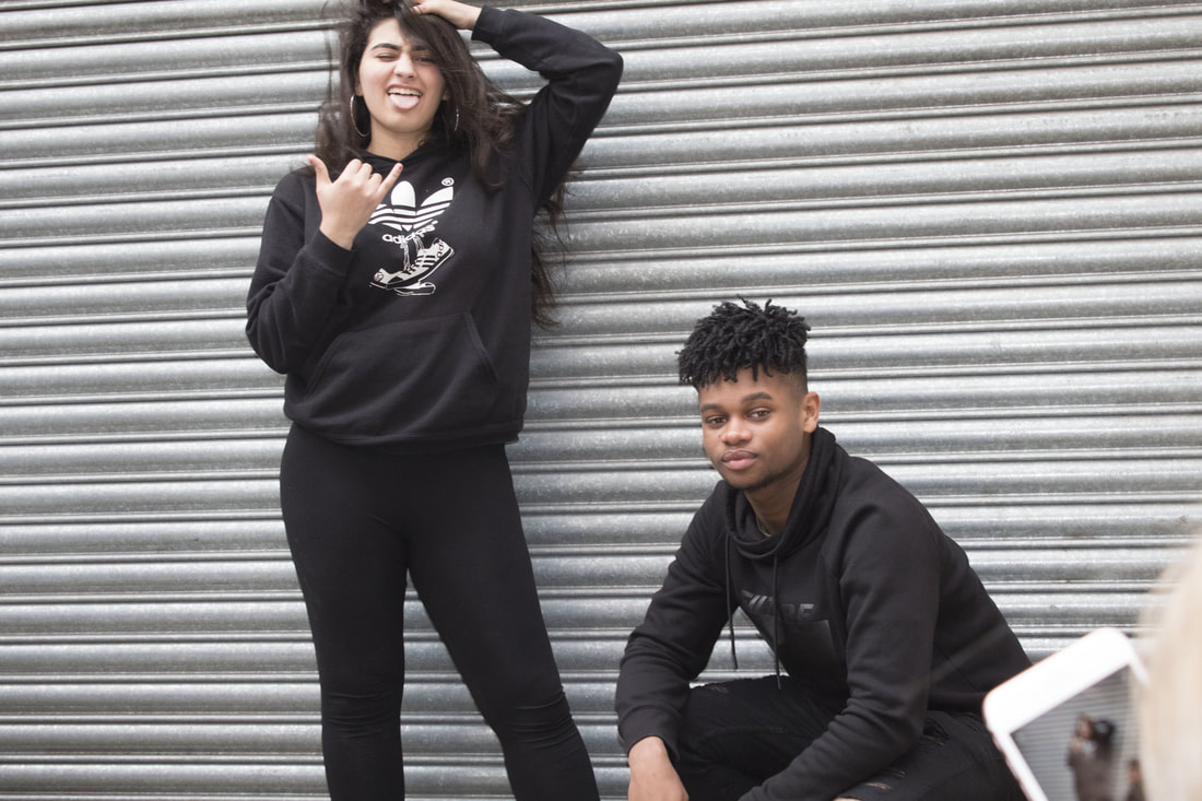
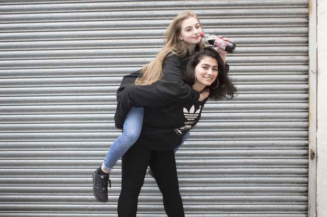
My Original Photographs


|


|


|
My Edited Photographs
Original
|
Edited

|
1.Firstly, I went onto PicsArt and flipped the picture and cropped it because I wanted my magazine cover to look similar to the cover that inspired me.
|
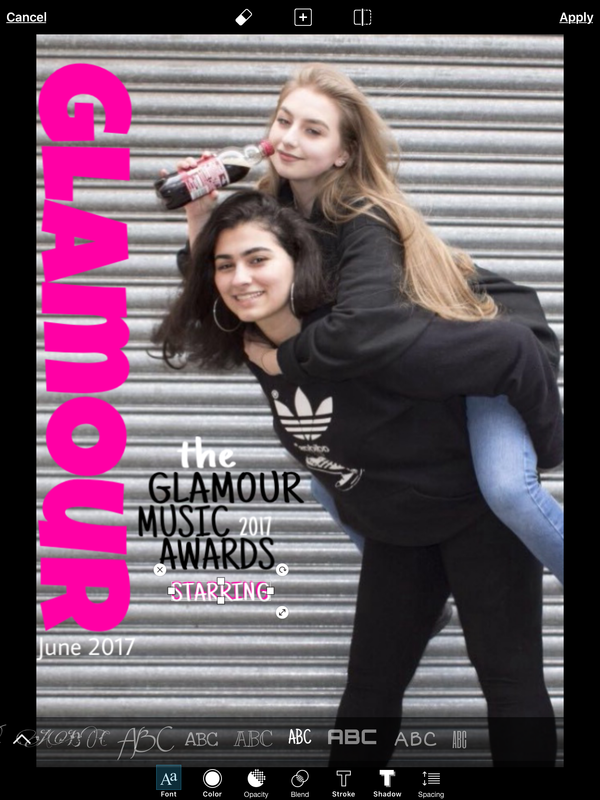
2. I then added the title 'Glamour' and then added a lot of cover lines onto the photograph so it now looks like a magazine cover, I put the title big and on the left hand side to make it look similar to the cover that inspired me.
|
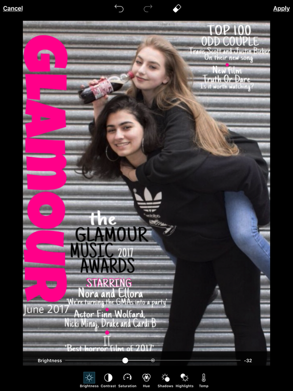
3. After I turned the brightness down a bit because it was too light and some of the models features where really pale and not as visible. I like that I did this as it makes the magazine cover look better.
|

4. The last thing I did was put the contrast up a bit to make it look a lot better and more professional.
I really like the outcome of this magazine cover. My favorite thing about it has to be the cover lines as they look different compared to a lot of magazine. |
Original

|
Edited

|
Original

|
Edited

|
Final Piece
|
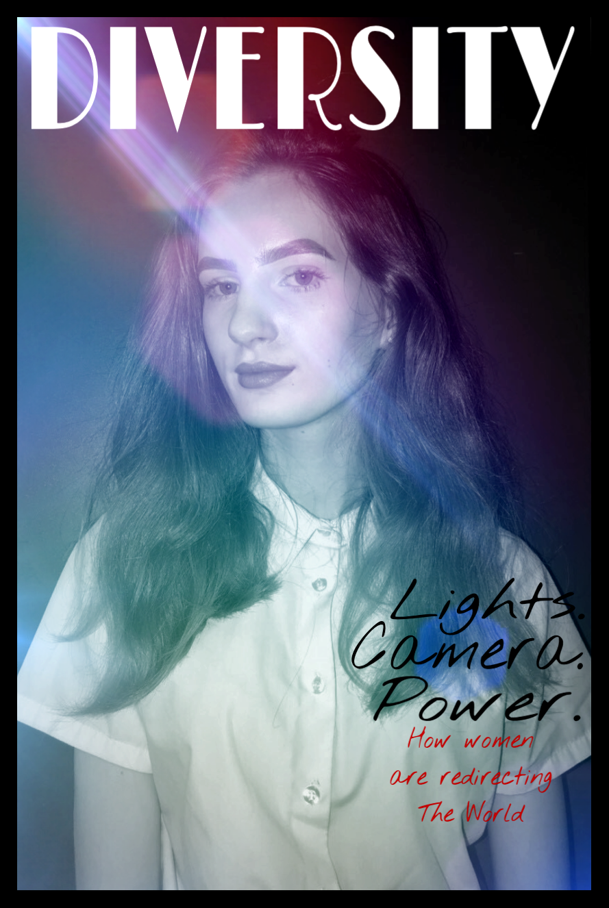
The photograph shows a magazine cover that I have made myself in the style of many magazines: TIME magazine, Variety magazine and Billboard magazine. The background is dark in the right hand corner however in the rest of the background is lens flares coming out from the left hand side. In the foreground there is my model posing and the title and cover lines of my magazine cover.
The most important thing in this magazine cover is the model with all the lens flares on her face as it attracts the most attention. The original picture was taken in a room with a dark background, I wanted a darker background as I feel like you could do a lot more with a darker one rather than lighter. A flash was used while taking this picture to make the features on the models face stand out a bit more. I love how this magazine cover turned out as it assembles many magazines and I decided to merge them all together to make this one. However, I dislike some things on this magazine cover like I think that the text of the cover line could've been a bit smaller and a different font also I feel like it didn't need the border as much but I decided to keep it. |
Editing Process
1. Firstly, I went onto PicsArt and cropped the picture . After that I made the picture black and white, I did this because I haven't done it and I was curious to see what it'd look like
|
2. I then added multiple lens flares because I really liked how they looked when I did it for the recreation of 'Variety' magazine.
|
3. Then I added the title 'Diversity' as that was my favorite title that I made, I then added only a few cover lines like in the TIME magazine because I wanted the model and the lens flares to be the main focus of the magazine cover. I then added a border also taking inspiration from TIME magazine.
|
